Amazon A+ / Content Strategy / Graphics
Client: Equal
Role: Lead Visual Designer
✺ Refresh A+ content for Equal Sweeteners and Creamers on Amazon with a new content strategy and visual design approach.
✺ A+ Content allows you to add images, text, and comparison tables to your Amazon detail page to engage readers and give them more information as they consider buying the product.
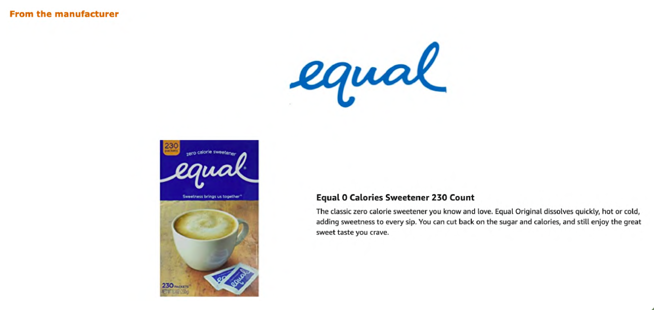
Equal Sweetener A+ before the revamp
For my process, I first brainstormed the points of emphasis for a successful design:
• Mobile-first strategy: Images and text large enough to read
• Make customers pause: Use bright, engaging, on-brand imagery
• Cohesion: brand store and A+ that match brand identity
• Streamline content for limited scrolling
• Use brand language: Keywords are not indexed for A9
• Make customers pause: Use bright, engaging, on-brand imagery
• Cohesion: brand store and A+ that match brand identity
• Streamline content for limited scrolling
• Use brand language: Keywords are not indexed for A9
Constraints: lack of assets and no brand guidelines
The result:
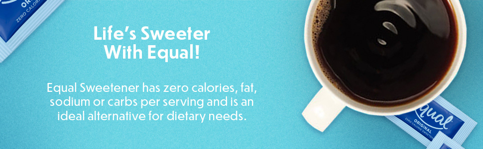
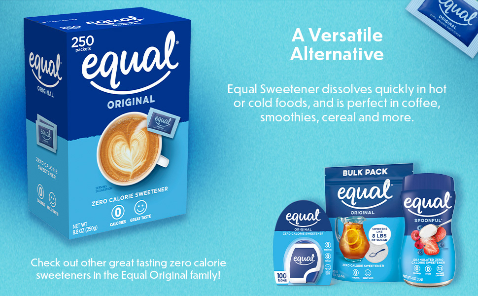
✺ The client wanted a product-specific page for every individual SKU. To keep the scope manageable and the brand identity strong, I devised a modular content system to provide specific and generic information across the catalog.
✺ Engaging and informative content gives customers purchasing confidence, making them 25% more likely to purchase a product.
✺ Received positive feedback from what had been an at-risk client to the agency; proudly presented design work at a board meeting.
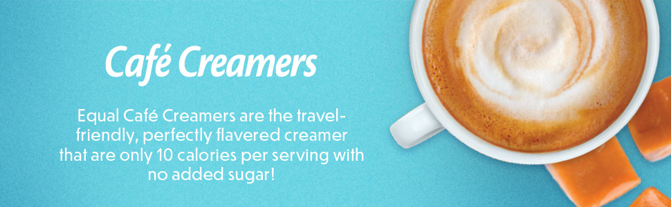
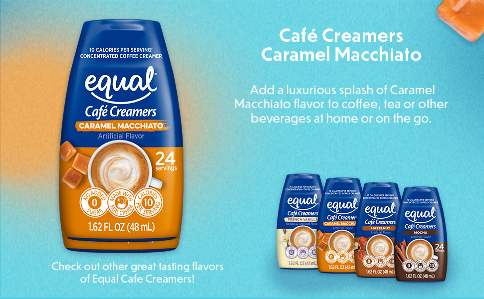
New Equal Creamers A+